A Avisse Member Sep 5, 2014 #1 which do you guys like? Attachments ScreenShot0007.jpg 330.1 KB · Views: 175 ScreenShot0024.jpg 380.9 KB · Views: 175
Rumble Kittie Member Sep 6, 2014 #2 You're so talented, Avis! I like the top one. It really shows off the nice shading you've done.
X Xairyen Member Sep 6, 2014 #3 I like the first one personally but maybe you could make the V dark like in the second? Just so it stands out a bit more.
I like the first one personally but maybe you could make the V dark like in the second? Just so it stands out a bit more.
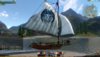
apogeesound Member Sep 7, 2014 #6 I like the first one, looks a bit aged. Like we're a guild that's actually had their sails exposed to the elements, doing work.
I like the first one, looks a bit aged. Like we're a guild that's actually had their sails exposed to the elements, doing work.
.SPiNE Active Member Sep 7, 2014 #7 I like the shading of that first 1 better, more depth. 8==========================================D
A Avisse Member Sep 7, 2014 #8 OK done. That's it folks. That's our official Archeage guild crest. Prolly will have a black background for capes and the galleon sails. Attachments ScreenShot0027.jpg 434.8 KB · Views: 121
OK done. That's it folks. That's our official Archeage guild crest. Prolly will have a black background for capes and the galleon sails.